MNprov: Non-profit Website Redesign
MNprov, a nonprofit dedicated to improv for confidence and connection, asked me to help refresh their website. Their old site felt cluttered, confusing, and didn’t consistently meet accessibility standards. Important content was buried, and visitors weren’t sure where to go next.
The redesign transformed MNprov’s website into a modern, inclusive platform that reflects their mission-driven brand, highlights their programs, and provides an accessible experience for all visitors.
Project Details
-
I started by meeting with the client to understand their mission, future goals, and current pain points. I then conducted a comprehensive audit to evaluate whether the site aligned with UX design principles (Percievable, Operable, Understandable, Robust) and accessibility best practices.
Using Google Lighthouse, WAVE and manual WCAG checks, I documented usability, performance and compliance issues: cluttered layout, inconsistent branding, poor heading hierarchy, missing alt text, low‑contrast color palette, lack of redundant navigation links, videos without transcripts, and not written in plain language.
This discovery phase helped me prioritize which improvements would best meet the organization’s needs, while delivering the biggest impact for accessibility, usability, and user engagement.
Outcome: Because the site was built in Squarespace, I focused on solutions that worked within platform constraints (no custom CSS), prioritizing accessibility and clarity without overcomplicating site management for the client.
-
I mapped out a strategic action plan based on the audit findings, client feedback, and platform constraints:
Information architecture & UX design
Reorganized the site into clear, user-friendly sections that guide visitors from curiosity to action. Mission, vision, values, and impact content was moved to a dedicated page to improve readability and reduce cognitive load on the homepage.
Mapped the user journey from entry → exploration → contact, and designed pages that reduce overwhelm while guiding users naturally toward taking action.
Accessible design & compliance
Rebuilt every page with WCAG best practices—correct heading structure, meaningful alt text, high-contrast color palette, and keyboard-accessible forms.
Added video transcripts and used accordion blocks strategically to reduce cognitive load for neurodivergent users while keeping navigation intuitive for everyone.
Performance & SEO
Optimized images, added SEO titles and descriptive meta tags, and streamlined formatting to improve page performance and search visibility.
Brand storytelling
Translated MNprov’s playful improv energy into a professional yet approachable digital presence — balancing credibility for corporate clients with accessibility and inclusion for community audiences.
Refined the color palette to align with MNprov’s logo.
Re-framed testimonials as “Standing Ovations” to highlight community impact and match the warmth and light-heartedness at the core of the organization’s purpose.
Outcome: A streamlined structure that reduces cognitive load and guides users toward action.
-
Remediation & Compliance
Applied WCAG 2.1 AA standards across all pages (headings, alt text, color contrast, link purpose, line and letter spacing).
Added transcripts for all videos, ensuring content was accessible to Deaf/HOH users.
Ensured forms were fully keyboard-accessible, with clear labels and error messages.
Conducted usability testing with a screen reader to confirm navigation and interactions were intuitive. Testing confirmed that the new heading structure and redundant footer links provided clear navigation paths for blind and keyboard-only users.
Updated footer to include redundant navigation links and key organizational info, reducing scrolling effort for all visitors.
Outcome: A streamlined, accessible site that reflects MNprov’s mission and makes it easier for both corporate partners and community members to connect with their work.
-
Working with MNprov was a genuine privilege. Their mission of using improv to build confidence, foster connection, and support real-world growth resonates deeply with my own values. It was inspiring to support an organization that prioritizes joy and belonging for the neurodivergent community.
While plain language standards weren’t applied throughout, I respected the decision to keep the copy as written — beautifully crafted by an award-winning author. I also want to specifically highlight that MNprov actively uses plain language in practice, especially in the game instruction slides for their in-person and virtual workshops. (I know, because I wrote them! [Link to Plain Language Game Slide Project].) My role in this project was to balance accessibility best practices with MNprov’s voice and priorities, ensuring that even within those choices, the site became more inclusive, structured, and user-friendly for visitors of all abilities.
This project gave me the opportunity to combine my skills in UX, accessibility, and systems thinking with my passion for equity and inclusion. It’s the kind of work that fuels me: practical, creative, and aligned with my belief that design should reduce barriers and create belonging.
Image Gallery
Explore highlights shown on key pages from the redesign.
Click each image for a short explanation, then continue scrolling for a detailed analysis.
A Closer Look
Explore the changes page by page to see how design and accessibility improvements came together.
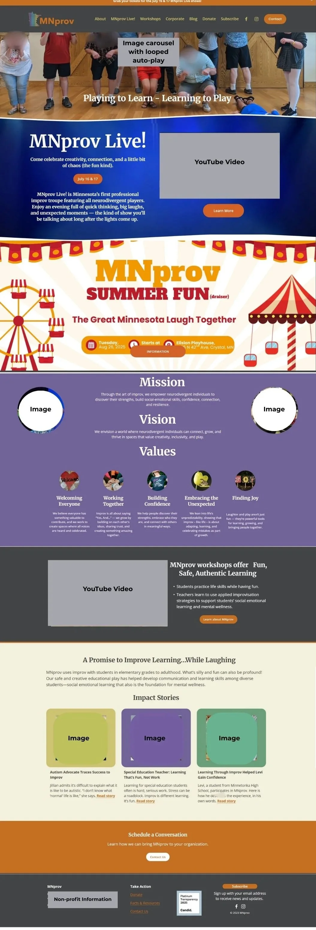
Homepage [Before]
The Challenges
Brand & Visuals
No visual hierarchy.
Organization’s purpose not immediately clear.
Cluttered layout with too many sections and competing for attention and focus.
Multiple themes distracted from core services.
Color palette felt inconsistent with their logo.
Mission, vision, & values were cluttered & hard to scan.
Calls to Action & SEO
Buttons scattered with no clear user path.
No SEO title or meta description to support visibility.
Accessibility
Visually heavy, too much info at once.
Image carousel with auto-play animation and no controls (play/stop/slow).
Important text placed inside images.
Low color contrast in several sections.
Overwhelmingly bright colors in other sections.
Inconsistent heading structure.
Missing image alt text and video transcripts.
Footer lacked redundant links.
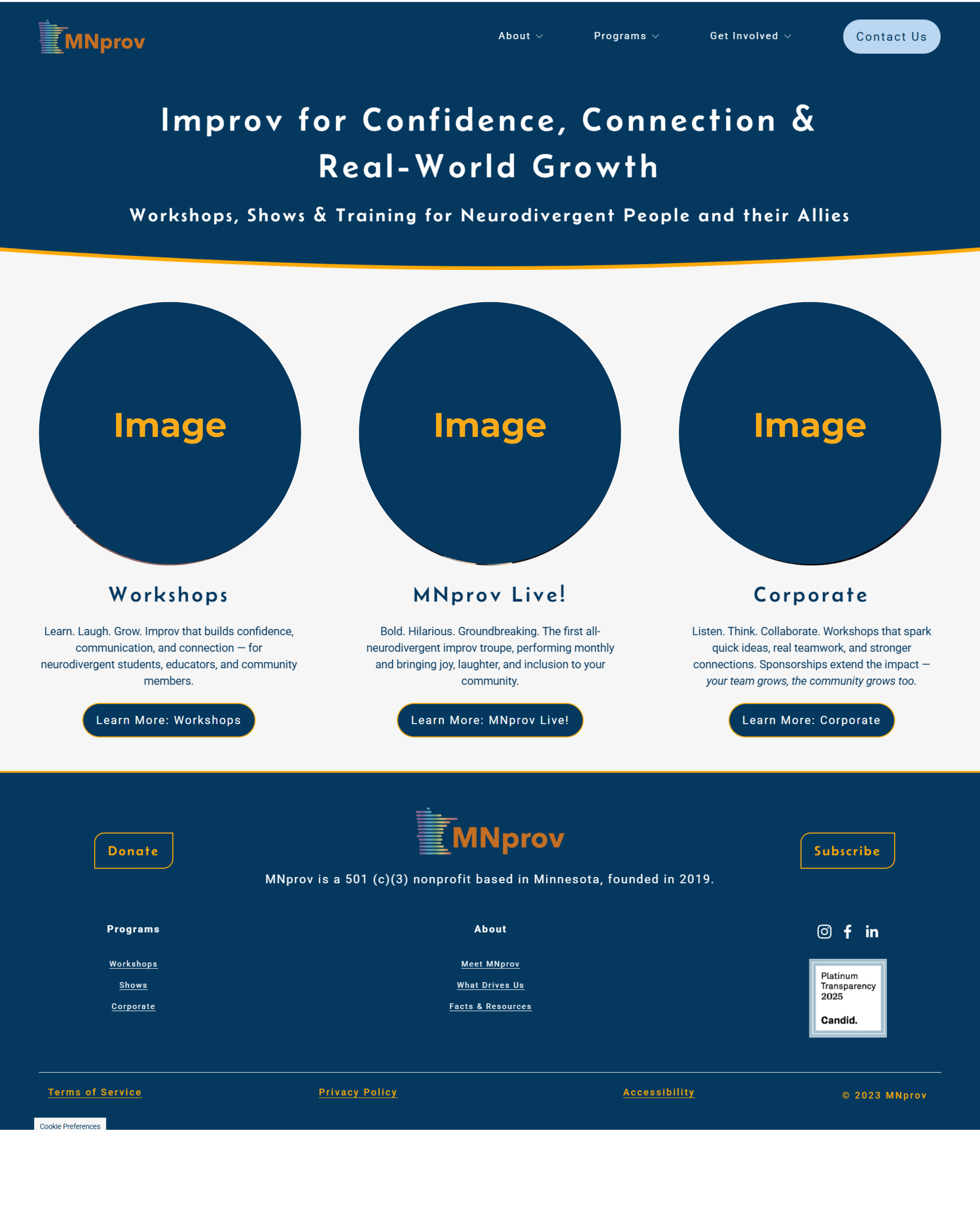
Homepage [After]
The Solutions
Brand Identity & Visual Hierarchy
Modern, symmetrical design with breathing room.
Updated color palette aligned with brand identity.
Consistent branding with clear messaging.
Simplified homepage flow with 3 clear offerings: Workshops, MNprov Live, Corporate.
Calls to Action & SEO
Buttons styled consistently & placed under each program.
SEO titles and descriptions added to every page.
Accessibility
Alt text and transcripts provided throughout.
Removed auto-play elements and competing themes.
High-contrast text and accessible color palette.
Larger font sizes with proper letter/line spacing.
Footer with redundant links & structured info.
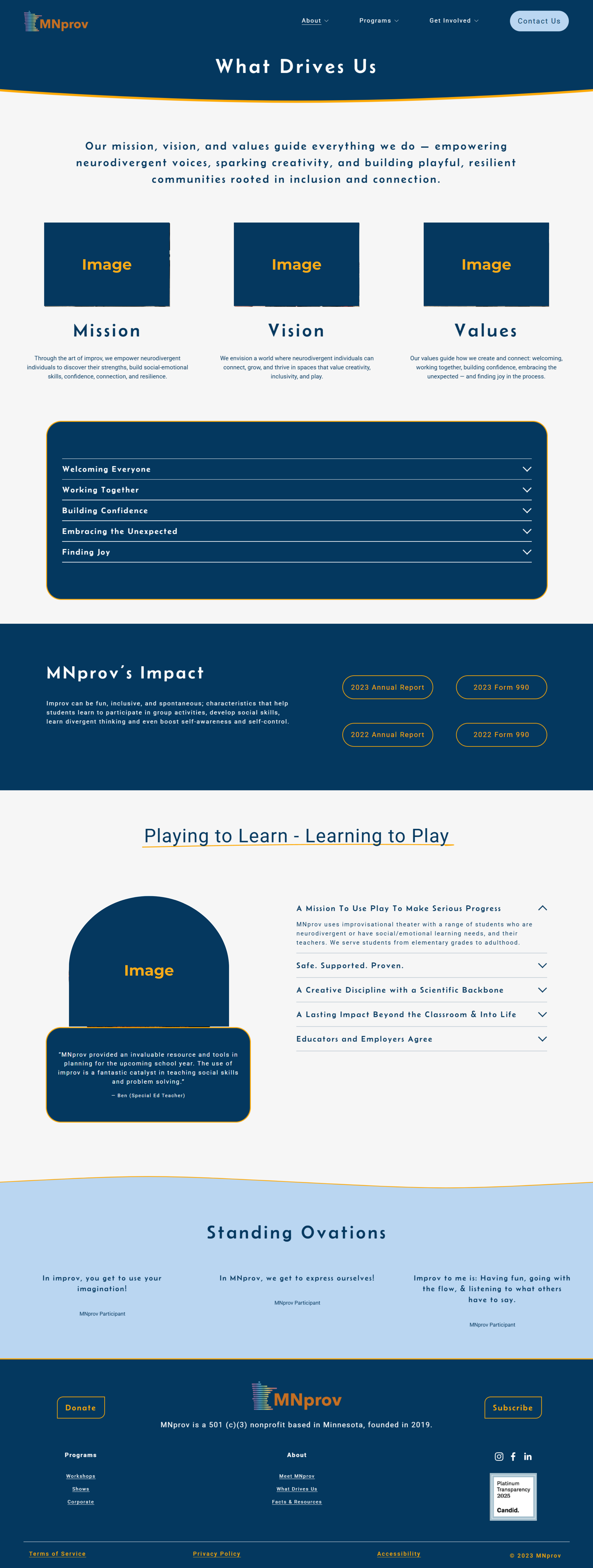
What Drives Us [New]
Mission - Vision - Values - Impact
Additional Solution
To reduce clutter on the homepage, I created a dedicated “What Drives Us” page to highlight MNprov’s mission, vision, values, and impact.
Mission, vision, and values content was reorganized into a dedicated space for storytelling.
Accordion blocks make the page easier to navigate, reducing cognitive load by letting visitors expand only the sections they want.
Impact content is now framed alongside the organization’s values, reinforcing their brand identity while keeping the homepage streamlined.
Corporate Training [Before]
The Challenges
Brand Identity & Visual Hierarchy
Color palette (purple, orange, beige) clashes with logo.
Cramped layout and visual clutter.
Long paragraphs & competing bold headers.
Headings lack visual breathing room.
Busy photo banner with awkward cropping.
Calls to Action & SEO
Contact form with no space or heading.
Small “Submit” button with low contrast.
No SEO title and description
Accessibility
Small text and low color contrast in some areas.
Long sentences without visual support structures (icons, bullets, headings).
Visual clutter with no clear hierarchy increases cognitive load and reduces readability.
Corporate Training [After]
The Solutions
Brand & Visuals
Strong hero section with simple, bold headlines and clear supporting text.
Consistent branding updated color palette
Testimonials section framed as “Standing Ovations” for a fun, on-brand touch.
Calls to Action & SEO
Clear calls to action, including a bold “Let’s work together” section.
Spacious, accessible contact form with visible “send” button.
SEO titles and meta descriptions added.
Accessibility
High-contrast text, accordion blocks, and scannable sections.
Image alt text and video transcripts.
Larger font sizes with adequate spacing for readability.
Simplified structure reduced cognitive load.
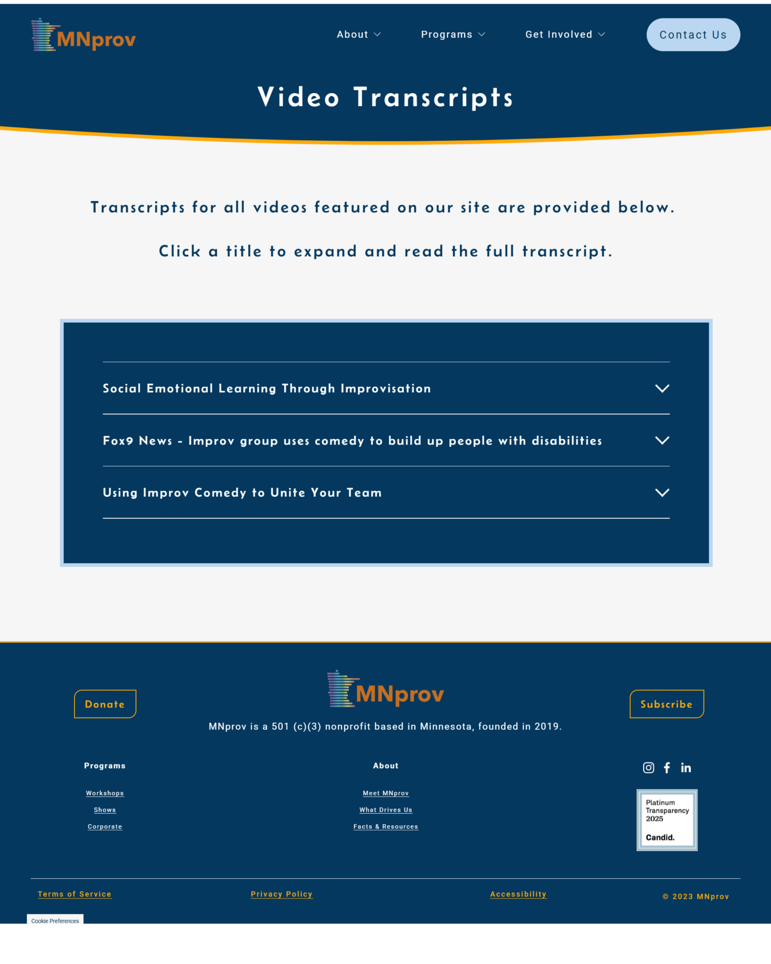
Video Transcripts Page [New]
An Accessibility Solution
To improve accessibility, I created a dedicated “Video Transcripts” page.
Each video on the site was transcribed and linked from this page.
Accordion blocks allow users to open one transcript at a time, reducing clutter and preventing overwhelm.
Each transcript section includes clear links to the video itself (on YouTube) and back to its location on the MNprov site, supporting easy navigation.
The page is intentionally simple — no extra images or distractions — to maintain focus and accessibility.


