Looking Forward Life Coaching: A Digital Transformation
Looking Forward Life Coaching is a small non-profit providing life coaching services for neurodivergent adults and teens (ages 16+). This organization needed a complete digital transformation that not only showcased the incredible work they are doing, but also aligned with their core values, and streamlined their internal workflows.
The original website had major security risks, slow load times, and serious accessibility barriers—like poor color contrast and broken mobile layouts—that made it difficult for the community to use.
As the designer, writer, and technology consultant, I completely rebuilt the site from the ground up. I simplified the technical setup, rewrote all the copy into modern, plain language, and achieved a perfect 100 accessibility score. I also built automated workflows for client intakes, scheduling, and hiring, which eliminated manual paperwork and directly increased the organization's client numbers within the first six months.
Project Details
-
An in-depth back-end security audit and front-end usability review revealed that the organization's legacy WordPress website was a major operational bottleneck and data liability. Key findings included:
Security and Data Vulnerabilities: The site had 4 high-risk and 9 medium-risk security flaws left unfixed, along with 32 outdated files and unprotected system folders. Automated hacker bots were constantly hitting the site, leaving the non-profit at a high risk for a data breach.
Compliance and Privacy Gaps: The organization's Google account was not set up to protect private health data (HIPAA compliance), and the online contact form didn't check for valid email addresses—creating big privacy risks for a coaching practice.
Poor Performance: Old, unused design themes and plugins slowed down the site so much that standard testing tools couldn't even measure its speed; the site simply timed out before loading.
Confusing Design with no Accessibility Features: The website did not work on mobile phones or tablets. It was also cluttered with outdated information, blank buttons, and broken links. It also lacked accessibility features such as image alt text and clear heading hierarchy (for screen readers).
-
Strategy and Design Solutions
To fix these security risks and cut down on paperwork, the entire website was moved from WordPress to a secure, easy-to-use Squarespace setup. The main solutions included:
Immediate Security Clean-Up: The back end of the old site was cleaned up to protect sensitive folders and remove outdated software. This stopped the threat of a data breach while the new website was being built.
Safe and Private Workflows: The organization's Google Workspace account was securely set up to meet strict client privacy rules. New internal policies and procedures were also written to keep all digital forms and messages secure.
Automated Client Booking: The broken online forms were replaced with an automated system that lets potential clients easily book their own "Discovery Calls." Information from these forms now flows automatically into Google Workspace, saving staff time.
Private Coach Portal: A password-protected portal was built directly on the website for the coaching staff. Connected to Google Workspace, it gives coaches quick access to internal guidelines and lets them schedule meetings with their supervisor. The entire system is built so staff can manage it easily without needing to know any computer code.
Complete Content Overhaul: I wrote and organized all website copy and organized information to clearly explain what the non-profit does in plain language. I also re-shot and edited all coach photos. The new content was separated into specific, dedicated pages, including a "Meet Our Coaches" bio page, an "Our Story" history page, a "Careers" page for receiving resumes, a community events calendar, an FAQ page, and a secure "Donations" system.
-
Accessibility Improvements
Because the organization explicitly supports neurodivergent adults and individuals with brain-based disabilities, digital accessibility was treated as a fundamental baseline requirement rather than an afterthought.
Elimination of Cognitive and Visual Clutter: Removed overlapping text layouts, low-contrast design choices, and confusing background patterns, replacing them with ample whitespace, clean visual flow, and highly readable, high-contrast fonts.
Assistive Technology and Screen Reader Optimization: Eliminated all empty links, dead buttons, and added image alt text. Fixed semantic coding issues by implementing proper web list structures, ensuring text elements remain readable.
Inclusive Media Formats: Co-created a professional introductory overview video and built an accompanying dedicated page hosting a comprehensive video transcript, resolving the previous lack of captions or transcripts.
Intuitive Navigation: Standardized the navigation headings and labels across all screens, utilizing plain language to make sure users can predict exactly where a button or link will take them before clicking it.
-
Reflection and Impact
Working alongside the team at Looking Forward Life Coaching (LFLC) was a great experience. Their focus on providing person-centered coaching that supports neurodivergent individuals as they “turn life’s stumbling blocks into stepping stones” aligns closely with my own approach to design.
This project allowed me to bring together UX design, digital accessibility, and systems thinking to address both front-end and back-end organizational needs. By focusing on plain-language copy, clear visual layouts, and automated workflows, we were able to build a tool that serves the whole organization. The new site reduces daily administrative friction for the staff, secures sensitive information, and provides a straightforward, accessible experience for every visitor.
Collaborating on this redesign was a wonderful opportunity to create a practical, secure digital space that removes unnecessary barriers and supports LFLC's day-to-day mission.
The measurable results of this redesign include:
Perfect Benchmarking Scores: The newly deployed web ecosystem successfully achieved a flawless score of 100 on Google Lighthouse metrics for Accessibility, Search Engine Optimization (SEO), and technical Best Practices, with every individual page scoring an 80 or higher for core Performance.
Organizational Empowerment: Transitioning to a clean, template-native framework allowed the client to completely break free from the expensive, unstable developer cycles common with legacy WordPress installations.
Dignified Access: The ultimate outcome is a professional, secure, and intuitive digital front door that treats every single visitor—regardless of cognitive profile, physical ability, or assistive technology preference—with equal dignity and seamless usability.
Image Gallery
Explore highlights shown on key pages from the redesign.
Click each image for a short explanation, or continue scrolling for a detailed analysis.
![Homepage [Before]](https://images.squarespace-cdn.com/content/v1/673a6931d91d750d0794a41b/1780349471609-43HD0D4QIXJHT4MG26NP/nonprofit-web-design-homepage.jpg)
![Coaches & Staff [Before]](https://images.squarespace-cdn.com/content/v1/673a6931d91d750d0794a41b/1780349496183-AVC3Q3H41GGCTETU750U/digital-accessibility-consultant-nonprofit-sonnauta-coaches-before.jpg)
![Donations Page [Before]](https://images.squarespace-cdn.com/content/v1/673a6931d91d750d0794a41b/1780349585508-8SHNME92PVNJ54WRRI8R/digital-accessibility-consultant-nonprofit-sonnauta-donations-before.jpg)
![Homepage [updated]](https://images.squarespace-cdn.com/content/v1/673a6931d91d750d0794a41b/1780349620489-8ZJDAOF2W6IAQYPTC8NC/non-profit-web-design-homepage-after.jpg)
![Meet Our Coaches [new]](https://images.squarespace-cdn.com/content/v1/673a6931d91d750d0794a41b/1780353051282-K80RGHC3ZPLGHA0N4ZU1/digital-accessibility-website-design-sonnauta-solutions.jpg)
![Mission, Vision, and Values [new]](https://images.squarespace-cdn.com/content/v1/673a6931d91d750d0794a41b/1780349631034-3SLWDV2EXBAH4M6ROSOT/non-profit-Website+Redesign-Mission-Vision-Values.jpg)
![Donations Page [updated]](https://images.squarespace-cdn.com/content/v1/673a6931d91d750d0794a41b/1780349638063-Y99KG72M0G3UKCCXFIZA/nonprofit-website-consultant-donations.jpg)
![Discovery Call [new]](https://images.squarespace-cdn.com/content/v1/673a6931d91d750d0794a41b/1780349656050-DFFAABTQ6MF6UFD2X6XH/nonprofit-website-discovery-call.jpg)
![Contact Form [new]](https://images.squarespace-cdn.com/content/v1/673a6931d91d750d0794a41b/1780349659356-IINKZGAFVCCLVPNK44PW/Nonprofit-website-design-Contact-Form.jpg)
A Closer Look
Explore the changes page by page to see how design and accessibility improvements came together.
Homepage [Before]
The Challenges
Backend & Security Liabilities
Several high and medium risk vulnerabilities on legacy site.
Traffic from automated hacker bots triggering wave of 404 errors and skewing site metrics.
Multiple pending updates and multiple inactive plugins and themes, reduced both speed and security.
Site loaded so poorly that standard testing tools timed out before they could generate a performance score.
Front-End Homepage Challenges
No SEO title or meta descriptions throughout the site.
Poor Color Contrast and Visual Clutter made it very difficult to read.
Lack of clear heading structure, as well as empty buttons and broken links made screen readers ineffective.
Layout was not responsive and broke when viewed on phones or tablets.
Social proof section difficult to see and included just one, very old quote.
No links to the organization’s social media.
Outdated terms and vocabulary relevant to the community they serve.
Accessibility
Poor color contrast and visual clutter.
No video captions or transcript.
Inconsistent heading structure.
Empty buttons and broken links.
No image alt text throughout the site.
Footer lacked redundant links.
Homepage [After]
The Solutions
Back-End and Operational Success
Site migrated to user-friendly, streamlined platform with Google Workspace integration.
Data secured by addressing underlying vulnerabilities and blocking bot traffic.
Automated workflows connect online forms directly to the backend to cut down on paperwork.
Internal policies updated to support new workflows and confidentiality requirements.
Site loads reliably and passes standard performance tests.
Front-End Improvements
Clear page titles and descriptive meta tags so the site can be easily found online.
Organic, calming color palette paired with modern layout and clear visual hierarchy.
Responsive design that automatically fits phones, tablets, and computers.
Consistent branding with clear value proposition and call-to-action buttons.
Copy uses modern, inclusive language that fits the community they serve.
Embedded introductory video with call-out pointing users to an "Accessible Video Page" containing full transcript.
Prominent "Book a FREE Discovery Call" buttons, streamlining client onboarding pipeline.
Automated workflow that supports self-scheduling for Discovery Calls.
Clear links to the org’s social media platforms included in the footer.
Prominent social proof section showcases up-to-date client success stories.
SEO and metatags added to every page.
Perfect 100 Google Lighthouse scores on standard accessibility, SEO, and best practice metrics.
Site Accessibility
Color contrast, font size, and letter/line spacing meets WCAG standards across the site so text is easy to read.
Embedded new introductory video with clear links to full transcript.
Heading structure organized and image alt text added so visual content is accessible.
Buttons and links clearly say where they will take the user.
Footer with redundant links & structured menu options.
Mission - Vision - Values & Coaches [Before]
The Challenges
Mission, vision, values, and staff roster on a single, long page.
Outdated information and listed coaches who no longer worked there. No information about the coaches, such as short bios.
Unclear next steps in user journey with no call-to-action buttons, options to book an appointment, or visual cues.
Extremely small text, poor color contrast, and repeating background made text difficult to read.
No logical headings and list semantics, making screen reader navigation ineffective.
Awkwardly cropped images and headshots with no alt text.
Backend software clutter, caused poor page performance.
What Guides Us [New Page]
Mission - Vision - Values - Impact
Solution: What Guides Us
To reduce clutter on the About Us page, I created a dedicated “What Guides Us” page to highlight LFLC’s mission, vision, values, and impact.
Wrote new copy using modern, inclusive terms (relevant to the community they serve) and plain language to clearly explain the non-profit's core goals and community impact.
Background with solid, high-contrast sections that are easy to read.
Organized text with a logical heading hierarchy that screen readers can follow.
Interactive accordion dropdowns for the "Values" section to share information without cluttering the screen.
Added an "Impact" section with icons to clearly show community statistics and highlight partner organizations.
This section also helps strengthen relationships with current partners. This leads to shared web links (backlinks) that improve the site's overall performance and search ranking on Google.
Prominent call-to-action buttons like "Support Our Mission" and "Make a Donation" to give visitors a clear next step in their journey.
Meet our Coaches [After]
Solution: Meet our Neurodiversity Coaches
Coach roster shown on dedicated page to separate the staff list from the mission and values text.
Directory featuring only current, active coaches.
Responsive design with clean grid layout.
Shot and edited new, professional headshots for all coaches to ensure visual continuity.
"Read Bio" buttons under each headshot that link directly to an expanded bio for each coach on a separate page.
All coach bios were updated, formatted, and edited for clarity and consistent tone.
Donations Page [Before]
The Challenges
White headline and body text over busy, colorful background made it almost impossible to read.
Primary heading on the left side of the screen cut off completely.
Buttons with broken links.
Promotional block for "AmazonSmile," which is an outdated, discontinued program.
No proper structure for the donation buttons, making screen reader navigation ineffective.
Design not responsive to different devices, causing elements to distort or overlap when viewed on phones and tablets.
Donations Page [After]
Solution: Donation Page
Improved color contrast to improve readability.
Updated, functional donation system.
The organization received a major donation within the first month of launching the new site.
Clear, interactive donation form that lets users select set amounts or enter a custom donation.
New feature allows donors to choose recurring monthly donations and/or opt to cover processing fees.
Buttons with descriptive, screen-reader-friendly actions like "Make a Donation.”
Clean grid layout that scales fluidly and remains responsive across phones, tablets, and desktops.
Improve page load speeds.
Logical heading hierarchy for page content and alt text for all images to ensure strong SEO and accessibility.
Inspiring hero banner and structured information to clearly explain where donation funds go.
Testimonial layout integrated at the bottom to build trust by sharing meaningful feedback from coaching clients.
Contact Form [New Page]
Solution: Get in Touch
Created a brand new contact page to replace the legacy site's inaccessible, phone-only method.
Online form automated with Google Workspace to eliminate manual data entry.
Streamlined internal staff workflows to reduce administrative processing time.
Shortened client response times, increasing overall client numbers within the first six months.
Provided an accessible digital communication option for a community that prefers alternatives to phone calls.
Clear "Book a Free Discovery Call" CTA button at the top for immediate user action.
Responsive grid layout that works across devices.
Clear heading hierarchies and image alt text to support screen readers and SEO.
Improved page load speeds.
No broken links.
Safe and secure payment processing method to protect donor data.
Interactive testimonial carousel to showcase client success stories.
Free Discovery Call [New Page]
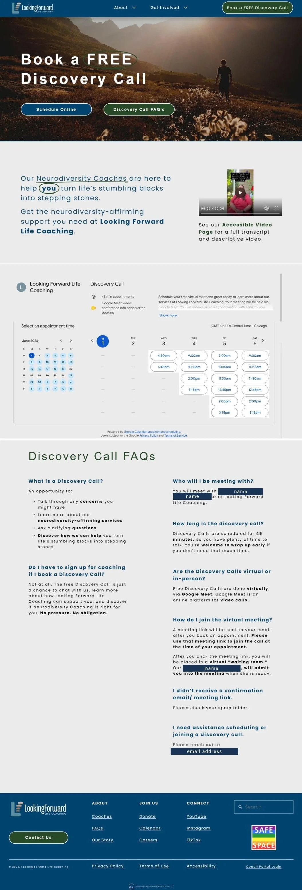
Solution: Book a Discovery Call
Created a brand new, dedicated booking page for Free Discovery Calls to replace the old process that required clients to leave phone voicemails.
Interactive, live calendar widget that lets potential clients view availability and schedule their own free discovery calls instantly.
Automated the internal scheduling workflow through Google Workspace, eliminating administrative email and phone tag.
Drastically reduced scheduling response times, directly contributing to gaining new clients within the first six months.
Equitable, accessible alternative to phone-based scheduling for neurodivergent users who face phone anxiety barriers.
High-contrast hero section with immediate anchor buttons to "Schedule Online" or read "Discovery Call FAQ's."
Embedded introductory video with a direct, clear link to an accessible video page containing full text transcripts and audio descriptions.
Plain-language FAQ section beneath the scheduler to answer common questions about the discovery call, and alleviate user uncertainty.
Clear heading hierarchies and high-contrast styling to optimize screen reader compatibility and search engine discovery (SEO).
Additional Pages and Features
The site redesign also introduced several new pages and features that are not displayed in this portfolio case study:
Video Accessibility Page: A dedicated space containing full text transcripts and descriptive audio for all video content. To ensure easy access, a direct link to this page sits in the caption below every video across the site.
Coach Bios: A page showcasing each coach's professional background, coaching approach, current availability, and personal interests. Visitors can easily reach these expanded profiles by clicking the "Read Bio" button beneath any headshot on the team directory.
How It Works (FAQ): A user-friendly page that uses dropdown menus so visitors can explore answers to common questions one at a time, at their own pace. The bottom of the page features a welcome video, a client testimonial section, a coach photo carousel, and a clear button to schedule a discovery call.
Our Story: A dedicated page sharing the organization’s history and background. It highlights short profiles for the three core staff members, features a coach directory carousel, and provides immediate next steps through clear navigation buttons to book a call, meet the coaches, or view upcoming events.
Upcoming Community Events: A public schedule listing the local events where staff members will be representing the non-profit. Each listing outlines the event details, credits the coordinators, links to the main event website, and invites prospective clients to connect with the team in person.
Careers & Volunteering: A recruitment page featuring active job descriptions, volunteer openings, and a streamlined application form with file upload options for resumes and cover letters. This entire application workflow is automated through Google Workspace to instantly alert internal staff and minimize response times for applicants.